What makes a pricing table design convert?
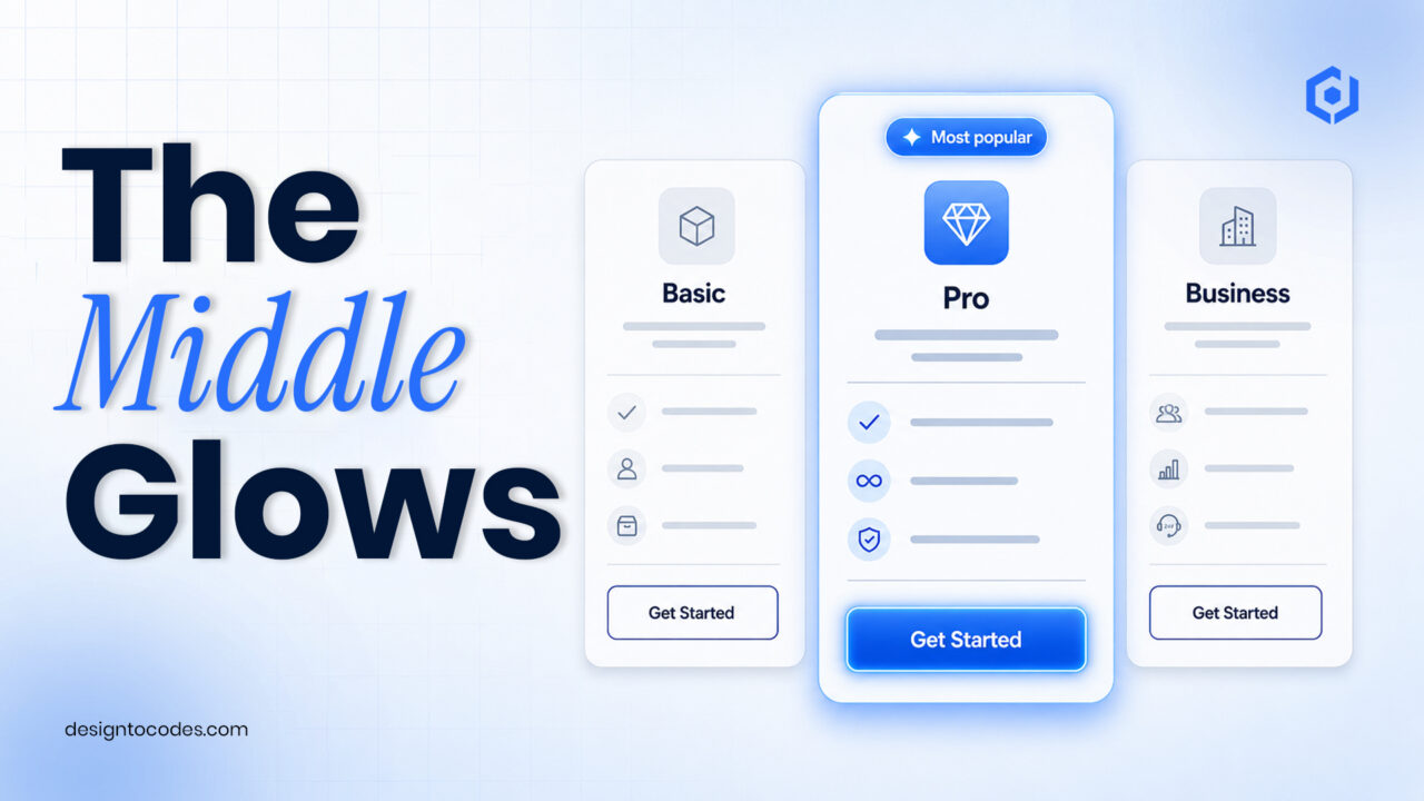
A pricing table converts when it makes choosing easy: three tiers, a clearly highlighted recommended plan, value-led descriptions instead of raw feature lists, and one obvious call to action per plan. People don’t study pricing tables — they scan them for permission to pick. Your job is to make the right choice the obvious one.
The anatomy of a converting pricing table
- Three tiers. Two feels thin; four causes paralysis. Three lets you anchor and guide.
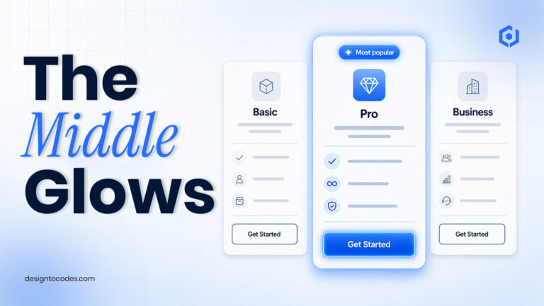
- A highlighted middle plan. A “Most popular” badge and subtle visual lift steer the eye to your target plan.
- Value-led lines. “Unlimited projects” beats “project management module.” Lead with the benefit.
- One CTA per plan. Same label, consistent weight — “Start free,” “Choose Pro.”
- A price and a billing toggle. Monthly/annual with the annual savings shown.
Copy-paste pricing table (HTML + CSS)
<section>
  <div><h3>Starter</h3><p>$0</p>
    <ul><li>1 project</li><li>Community support</li></ul>
    <a href="#">Start free</a></div>
  <div><span>Most popular</span>
    <h3>Pro</h3><p>$19</p>
    <ul><li>Unlimited projects</li><li>Priority support</li></ul>
    <a href="#">Choose Pro</a></div>
  <div><h3>Team</h3><p>$49</p>
    <ul><li>Everything in Pro</li><li>5 seats</li></ul>
    <a href="#">Choose Team</a></div>
</section>
.pricing{display:grid;gap:16px;grid-template-columns:repeat(auto-fit,minmax(220px,1fr))}
.tier{border:1px solid #e5e7eb;border-radius:12px;padding:24px;text-align:center}
.tier.featured{border-color:#4a9eff;box-shadow:0 8px 30px rgba(74,158,255,.15);transform:translateY(-6px)}
.badge{background:#4a9eff;color:#fff;font-size:.75rem;padding:3px 10px;border-radius:20px}
.price{font-size:2rem;font-weight:700;margin:.3em 0}
.btn{display:inline-block;background:#4a9eff;color:#fff;padding:12px 24px;border-radius:8px;text-decoration:none}
The psychology (used honestly)
Anchoring makes the middle plan feel reasonable next to a higher tier. A “Most popular” label leverages social proof. Fewer, benefit-led lines reduce the effort of comparing. None of this is manipulation when the plans are fair, and the labels are true — it’s just removing friction from a decision the visitor already wants to make.
Mistakes that lower conversions
- Too many tiers (four+), which causes decision paralysis.
- Feature-dump lists that force the visitor to do the translating.
- Hiding the price behind “contact us” for a self-serve product.
- Different CTA styles per plan, which reads as indecision.
Accessibility & mobile
- Real buttons/links, focusable and labeled; contrast at least 4.5:1.
- Stacks cleanly on mobile (the grid above does this automatically).
- Don’t rely on color alone to mark the recommended plan — use the badge too.
Want tested pricing and section blocks? Our UI section kits include conversion-ready patterns you can drop in.
Pricing table mistakes and fixes
| Mistake |
Why it hurts |
Fix |
| Four or more tiers |
Decision paralysis |
Three tiers; anchor and highlight one |
| Feature-dump lists |
Visitor must translate features to value |
Lead each line with the benefit |
| “Contact us” for a self-serve product |
Adds friction, lowers trust |
Show prices; reserve contact for enterprise |
| Different CTA styles per plan |
Reads as indecision |
One consistent CTA per plan |
| No highlighted plan |
Undecided visitors stall |
Mark a “most popular” middle plan |
Want conversion-ready pricing and section blocks? Our UI section kits include tested patterns you can drop in.
Frequently asked questions
How many pricing tiers should I have?
Three in most cases. Two can feel thin, and four causes decision paralysis; three lets you anchor and highlight a recommended plan.
Should I highlight a plan in my pricing table?
Yes. A clearly highlighted “most popular” middle plan guides the choice and typically lifts conversions, as long as it’s genuinely a good fit for most buyers.
Should I show prices or use “contact us”?
For a self-serve product, show prices — hiding them adds friction and lowers trust. Reserve “contact us” for genuinely custom enterprise plans.