

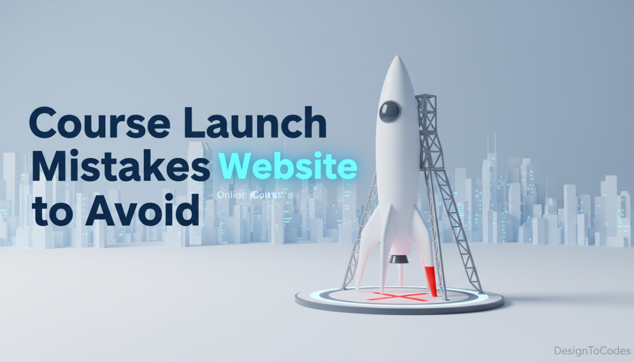
Mistakes to Avoid When Launching an Online Course Website
Why Most Course Launches Don’t Perform as Expected What if
On this page
Why Most Course Launches Don’t Perform as Expected
What if the answer you’ve been searching for was hiding in plain sight all along? In a world overflowing with information, we often find ourselves overwhelmed, unsure of what truly matters and what doesn’t. Launching an online course platform with an Education Framer Template might seem like a fast track to success, but many creators unknowingly make critical mistakes right from the start. Whether it’s cluttered layouts, unclear messaging, or ignoring the learner’s journey, these issues can quietly damage your website’s performance before it even gains traction. A well-designed template is only as effective as how thoughtfully you use it.
This is where many creators get stuck.
The problem is rarely the course itself. More often, the issue lies in how the website presents the course. A poorly structured site fails to guide visitors, build trust, and encourage action. Instead of acting like a sales assistant, it behaves like a static brochure. This is why choosing the right Online course website template or a structured Education Framer Template is not just a design decision. It is a strategic decision that directly impacts conversions, user experience, and overall success.
In this blog, we will break down the most common mistakes creators make when launching a course website, explain why they happen, and provide practical solutions you can apply immediately.
Mistake 1: Focusing on Design Instead of Structure
Many course creators prioritize visuals over usability. They spend time selecting colors, fonts, and animations but overlook how the content is organized. A beautiful website without structure creates confusion.
Visitors may admire the design but still struggle to understand what the course offers or how to enroll. This disconnect leads to drop-offs. An Online course website template solves this problem by providing a proven layout where every section has a purpose. A well-designed Education Framer Template ensures that content flows logically from introduction to enrollment.
Why This Matters
When users land on your site, they should instantly understand:
- What the course is about
- Who it is for
- What outcome they will achieve
If this clarity is missing, conversions drop.
Mistake 2: No Clear Learning Outcome
One of the biggest reasons visitors hesitate is uncertainty. If they cannot clearly see what they will gain from your course, they will not commit. Many websites describe features instead of outcomes.
For example, saying “10 video lessons” is less effective than saying “Learn how to build a full-stack web app from scratch.” A structured Online course website template highlights outcomes prominently, helping users visualize the value of the course. Similarly, an Education Framer Template places learning benefits in key sections where users naturally look.
Real Fix
- Focus on transformation, not features
- Use clear and specific outcomes
- Highlight results in the hero section
Mistake 3: Overloading Visitors With Information
It is tempting to include everything about your course on one page. Long descriptions, multiple sections, and detailed explanations may seem helpful, but they often overwhelm visitors.
Too much information creates friction.
Users do not read everything. They scan. If the page feels heavy, they leave. Before understanding the impact of this mistake, it helps to compare how overloaded pages differ from structured layouts. A well-built Education Framer Template organizes information into sections that are easy to scan. An Online course website template ensures that content is spaced properly and presented in a way that guides the user step by step.
| Content Approach | Overloaded Website | Structured Template |
|---|---|---|
| Content Length | Long unstructured text | Organized sections |
| Readability | Difficult to scan | Easy to navigate |
| User Experience | Overwhelming | Guided journey |
| Engagement | Low | High |
Solution
Break content into sections, use spacing effectively, and prioritize clarity over quantity.
Mistake 4: Weak Trust Signals
Trust is one of the biggest factors influencing enrollment decisions, and when visitors are unsure about your credibility, they are far less likely to commit to a purchase. Many course websites fall short by not including strong trust elements such as testimonials, reviews, or clear instructor credentials. A well-structured Online course website template helps solve this by providing dedicated sections for social proof, while an Education Framer Template ensures these credibility markers are placed strategically to build confidence. To strengthen trust, your website should clearly highlight student testimonials, real success stories, the instructor’s experience, and any relevant certifications or achievements.
These elements reduce doubt and encourage users to take action.
Mistake 5: Poor Call-to-Action Placement
Even if your website explains the course well, it may still fail if users do not know what to do next. Many websites hide the enrollment button or place it only at the bottom of the page. This forces users to search for the next step. A structured Online course website template places calls-to-action throughout the page. An Education Framer Template ensures that users can easily find enrollment options at key decision points.
Fix This By
- Adding multiple call-to-action buttons
- Placing CTAs after key sections
- Using clear action-driven text
Mistake 6: Ignoring Mobile Experience
A large percentage of users browse course websites on mobile devices. If your site is not optimized for smaller screens, you lose potential students instantly.
Common mobile issues include:
- Broken layouts
- Difficult navigation
- Slow loading speed
An Education Framer Template is designed with responsive layouts that adapt to all screen sizes. Similarly, an Online course website template ensures that mobile users have a smooth experience.
Why This Matters
Mobile users expect speed and simplicity. If your site fails to deliver, they will leave within seconds.
Mistake 7: Slow Website Performance
Speed plays a critical role in user experience, and even a delay of a few seconds can significantly increase bounce rates. Many online course websites end up performing poorly because they rely on heavy, uncompressed images, use too many unnecessary plugins, and lack proper optimization, all of which slow down loading times and frustrate users.
A well-built Education Framer Template focuses on performance optimization. An Online course website template ensures that pages load quickly and efficiently.
Actionable Fix
- Compress images
- Reduce unnecessary scripts
- Use optimized hosting
Mistake 8: No Clear User Journey
One of the most overlooked mistakes is the absence of a clear user journey. Visitors should move through the website in a logical sequence, from discovering the course to enrolling. Without this flow, users feel lost. Before looking at how to fix this, it is important to understand how structured templates guide users.
A strong Online course website template creates a step-by-step journey. An Education Framer Template ensures that each section leads naturally to the next.
| Stage | User Need | Website Section |
|---|---|---|
| Awareness | What is this course? | Hero section |
| Interest | What will I learn? | Course overview |
| Trust | Can I trust this? | Testimonials |
| Decision | Should I enroll? | Pricing & CTA |
Solution
Design your website to guide users through this journey clearly.
Actionable Blueprint: Fix Your Course Website Today
Here is a simple checklist you can follow:
- Clarify your course outcome
- Use structured sections instead of long text
- Add strong trust signals
- Optimize for mobile devices
- Improve page speed
- Place clear calls-to-action
- Use a proven Online course website template
- Choose a structured Education Framer Template
Implementing these steps can significantly improve your website’s performance.
Frequently Asked Questions
Why do most course websites fail after launch?
A. Most fail due to poor structure, unclear messaging, and weak user experience rather than lack of content quality.
What is an Education Framer Template?
A. An Education Framer Template is a pre-designed layout specifically built for course websites, offering structured sections and optimized performance.
How does an Online course website template help?
A. An Online course website template provides a proven framework that guides users, improves readability, and increases conversions.
Can templates improve enrollment rates?
A. Yes. A structured template reduces friction, builds trust, and makes it easier for users to enroll.
Avoid Mistakes, Build Smarter
Building a successful course platform with an Education Framer Template means avoiding common pitfalls like poor navigation, lack of mobile responsiveness, weak content structure, and failing to highlight your course’s unique value. When you prioritize user experience and keep your design clean and purposeful, your website becomes a powerful tool for engagement and conversions. This blog will walk you through the key mistakes to avoid so you can launch with clarity and confidence.
Launching a course website is not just about putting content online. It is about creating an experience that guides visitors toward enrollment. Mistakes like poor structure, unclear messaging, weak trust signals, and slow performance can quietly reduce your results. The good news is that these problems are fixable. By using a structured Online course website template and a well-designed Education Framer Template, you can avoid common pitfalls and create a platform that converts visitors into students.
When your website works as a guided journey instead of a static page, your course has a much better chance of succeeding. You’re no longer just avoiding mistakes; you’re building an online course website that’s smarter, sharper, and designed to win from day one.
Recent Posts


Recent Blogs
From the Journal
Why is updated CMS content not showing on a Next.js
- Oct 20, 2026
- 12:19 PM
Does a hotel website template include a working booking system?
- Oct 17, 2026
- 1:11 PM
How do you turn kitchen-project photos into a useful case
- Oct 13, 2026
- 11:46 AM
How do you build a gym class timetable that stays
- Oct 10, 2026
- 11:59 AM