
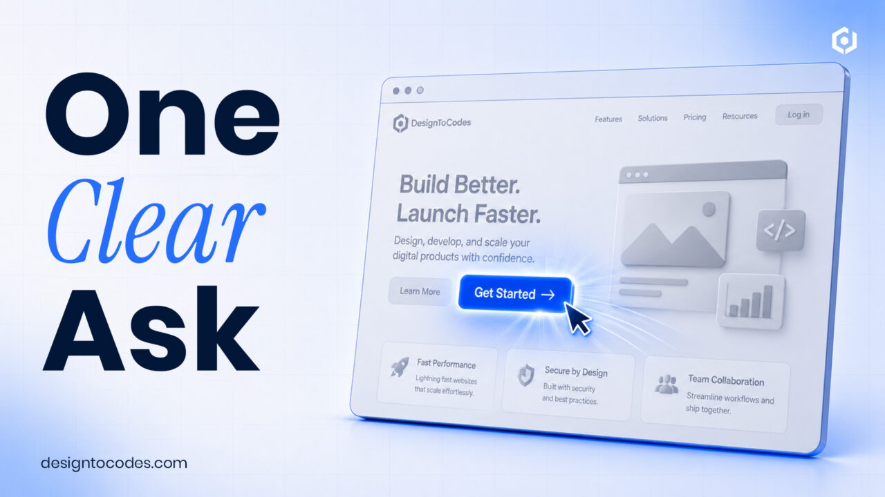
What makes a CTA section design actually convert?
A CTA section that converts makes one clear ask, removes competing choices, and earns the click with copy about the visitor’s outcome rather than your product. Reinforce it with a single line of proof and enough whitespace that the button is impossible to miss. Conversion comes from focus, not from a louder color.
Learn how to create cta section design properly.
The anatomy of a converting CTA section
Four parts, in order: a benefit-led headline (“Launch your site this weekend”), a one-line subhead that handles the obvious objection, a single primary button with action-and-outcome label text, and one trust cue (a rating, a user count, a guarantee). The fastest way to kill a CTA is to offer two equally weighted buttons — every extra choice lowers the odds of any choice.
Copy-paste CTA section (HTML + CSS)
<section>
  <h2>Ready to launch faster?</h2>
  <p>Production-ready templates that pass Core Web Vitals.</p>
  <a href="/templates">Browse templates</a>
  <span>Trusted by 40,000+ developers</span>
</section>
.cta{max-width:640px;margin:0 auto;padding:72px 24px;text-align:center}
.cta h2{font-size:clamp(1.6rem,4vw,2.4rem);line-height:1.15}
.btn{display:inline-block;background:#4a9eff;color:#fff;padding:14px 30px;
border-radius:8px;font-weight:600;text-decoration:none}
.cue{display:block;margin-top:12px;font-size:.85rem;color:#888}Write the button label like a promise
“Submit” and “Click here” describe a mechanism. “Get my free quote,” “Start building,” and “Browse templates” describe an outcome. The label is the most-read text in the section — spend a minute making it specific. As a rule, the button should finish the sentence “I want to…”.
CTA patterns by goal
| Goal | Primary CTA | Supporting cue |
|---|---|---|
| Free trial/signup | “Start free” | “No card required” |
| Lead/quote | “Get my quote” | “Reply within 24h” |
| E-commerce | “Add to cart” | “Free returns” |
| Content/download | “Send me the guide” | “Join 12,000 readers” |
Placement and rhythm
One primary CTA belongs in the hero; then repeat the same ask after you’ve made your case — typically after benefits or social proof, and again at the foot of the page. Keep the wording consistent so the visitor sees one decision repeated, not several. A mid-page CTA section is the highest-converting block on most long pages.
Accessibility and performance
- The button is a real
<a>or<button>, focusable and labeled. - Contrast of at least 4.5:1 between button text and background.
- Generous tap target (44px+) for mobile.
- No layout shift — reserve space if the section loads with the page.
Explore the best CTA section designs you should use in your projects
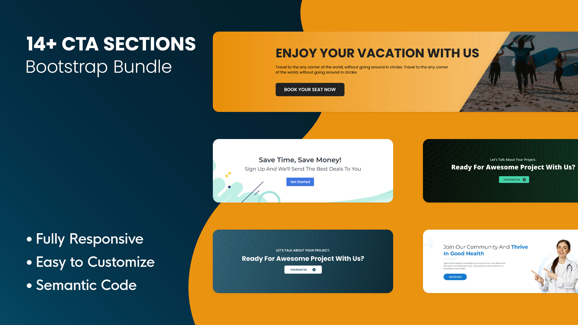
14+ Best Website Call To Action | Bootstrap UI Kits
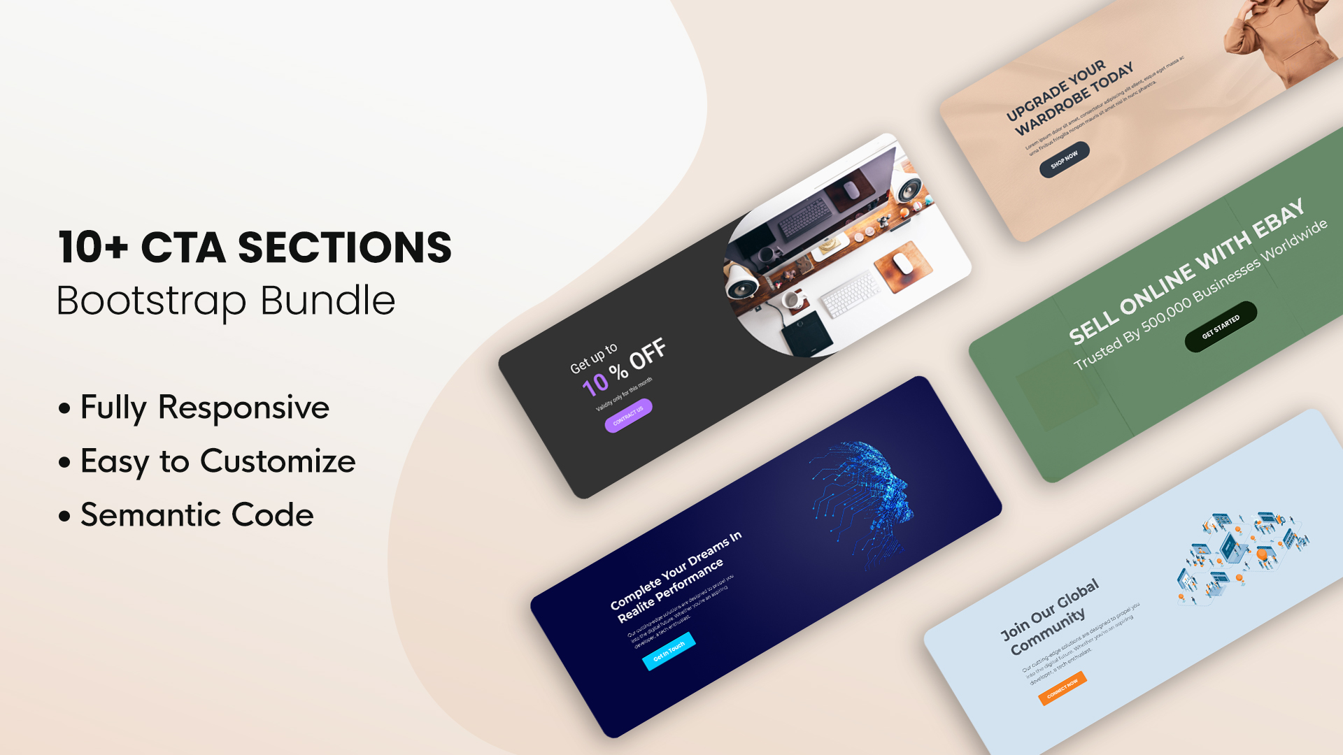
10+ Free Website Call To Action | Bootstrap UI Kits
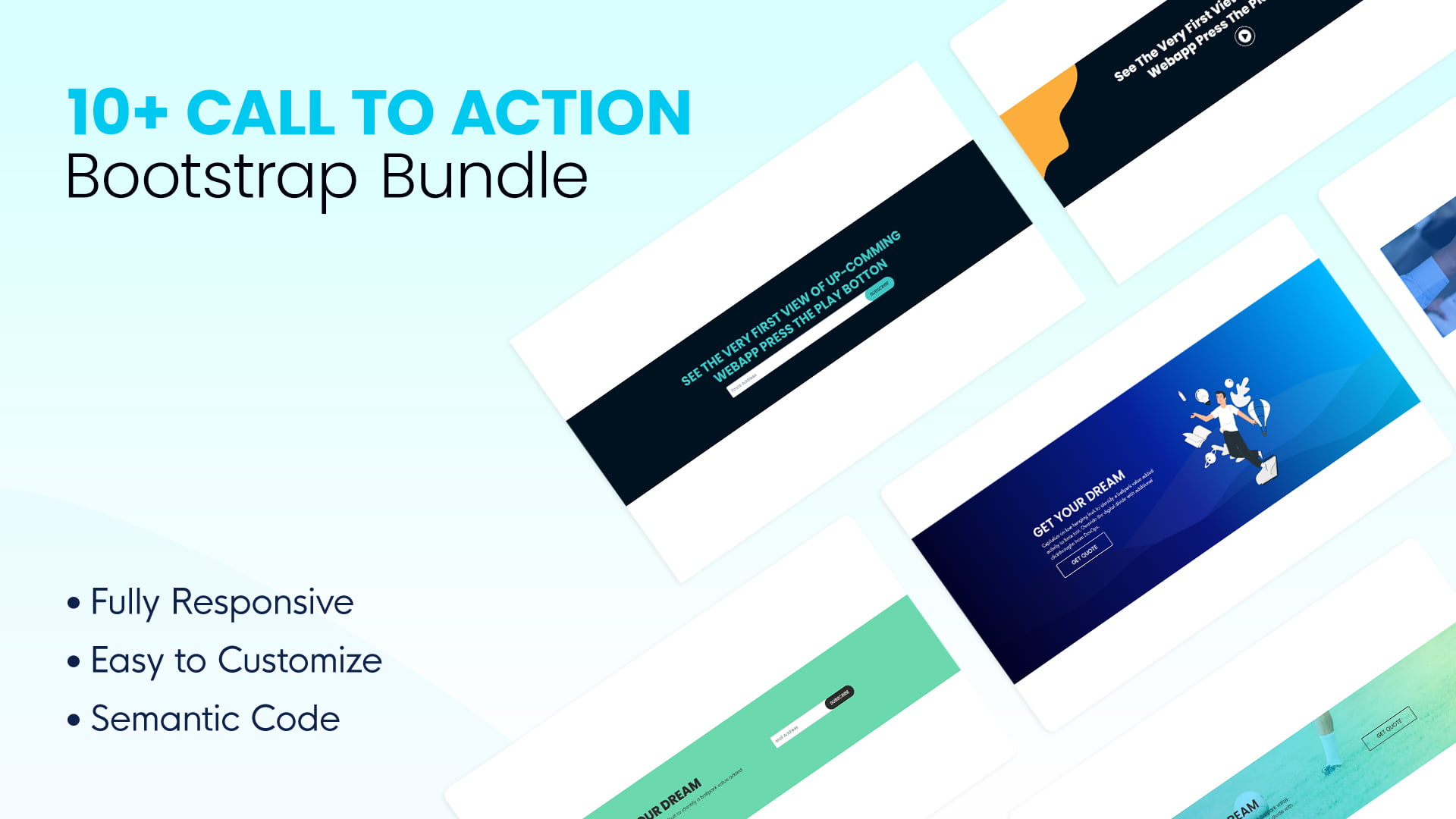
10+ Call To Action Web UI Kits | Bootstrap Bundle
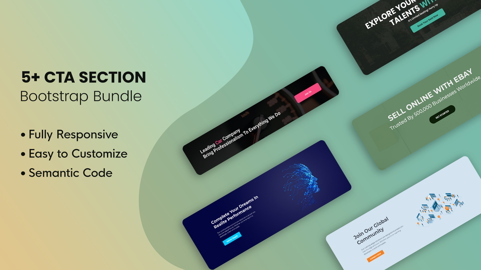
5+ Free Website Call To Action | Bootstrap UI Kits
Frequently asked questions
How many CTAs should a section have?
One primary call to action. A single secondary option as a quiet text link is fine, but two equally weighted buttons split attention and lower clicks on both.
What should a CTA button say?
An action plus an outcome — “Get my quote,” “Start building,” “Browse templates.” Avoid generic labels like “Submit” or “Click here” that describe a mechanism instead of a benefit.
Where should I place the CTA section?
In the hero, then repeated after your benefits or social proof, and again at the bottom. Use consistent wording so it reads as one decision, not several.
Want tested CTA blocks to start from? Browse the free DesignToCodes call-to-action sections.