What makes a hero section design convert visitors instead of losing them?
A high-converting hero section answers one question in under three seconds — “what is this and is it for me?” — with a clear headline stating the outcome, a one-line subhead, a single primary call to action, and a visual that supports the message instead of competing with it. The pattern below converts because it removes choices, not because it looks clever. Try DesignToCodes hero section design!
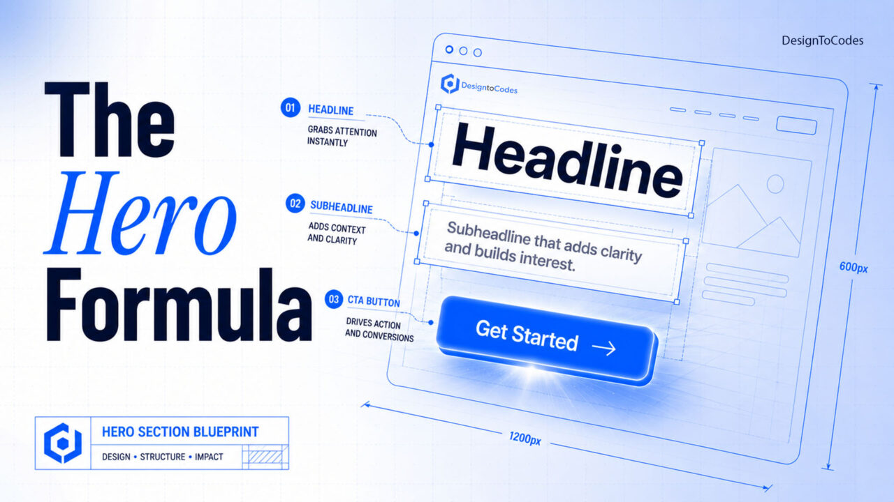
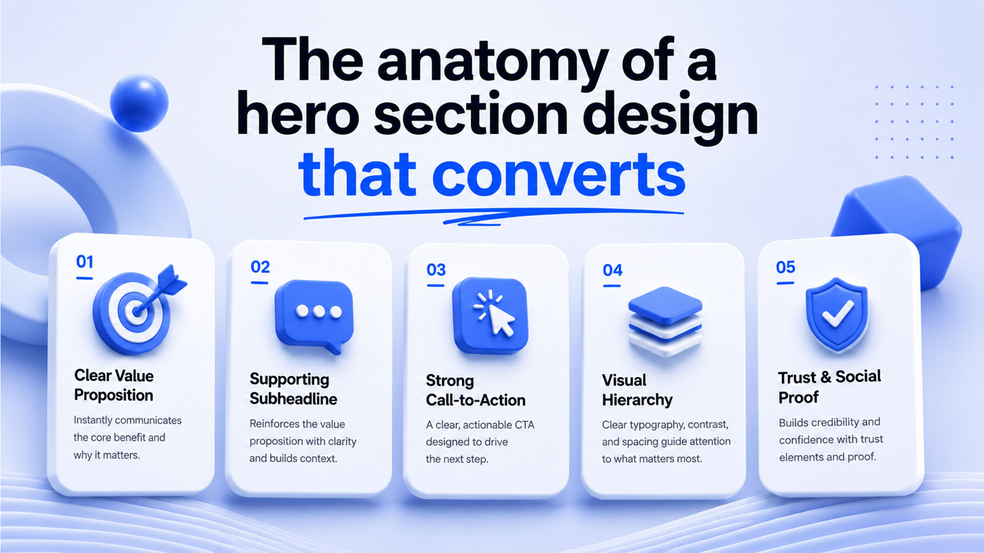
The anatomy of a hero section design that converts
Five elements, in priority order: a benefit-led headline, a clarifying subhead, one primary CTA (an optional secondary as a text link, never a second button of equal weight), a supporting visual, and one trust signal. The most common mistake is competing CTAs — two equally loud buttons split attention and lower clicks on both.
Write the headline first
Your headline should state the outcome the visitor wants, not what you do. Weak: “We build modern web templates.” Strong: “Launch a production-ready website this weekend.” The test: could a competitor place their logo above your headline and still be true? If yes, it’s too generic.
Copy-paste hero (HTML + CSS, no framework)
<section>
  <p>Production-ready templates</p>
  <h1>Launch a fast website this weekend</h1>
  <p>Hand-coded templates that pass Core Web
  Vitals out of the box. No bloat, no lock-in.</p>
  <a href="/templates">Browse templates</a>
  <span>Trusted by 40,000+ developers</span>
</section>
.hero{max-width:640px;margin:0 auto;padding:96px 24px;text-align:center}
.eyebrow{font-size:.85rem;letter-spacing:.08em;text-transform:uppercase;color:#4a9eff}
.hero h1{font-size:clamp(2rem,5vw,3.25rem);line-height:1.1;margin:.4em 0}
.hero .sub{font-size:1.125rem;color:#555;max-width:34ch;margin:0 auto 1.6em}
.cta{display:inline-block;background:#4a9eff;color:#fff;padding:14px 28px;
border-radius:8px;font-weight:600;text-decoration:none}
.cta:hover{background:#3580d8}
.trust{display:block;margin-top:14px;font-size:.85rem;color:#888}This renders in well under a second, has zero layout shift, and works on every screen via clamp(). It’s deliberately boring — and boring converts.
The five things that quietly kill hero conversion
- A carousel. Auto-rotating heroes test worse than a single static message almost every time. Pick one offer.
- A heavy background video that delays LCP past 2.5s and drains mobile data.
- Vague headlines that describe you rather than the visitor’s outcome.
- Two equal CTAs splitting intent.
- Text over a busy image with no overlay — fails contrast and accessibility.
Hero patterns by goal
| Goal | Layout | Primary CTA |
|---|---|---|
| SaaS signup | Centered text + product screenshot below | “Start free” |
| Lead gen | Split: copy left, short form right | “Get the demo” |
| E-commerce | Full-bleed product, minimal copy | “Shop now” |
| Portfolio | Name + role + one line, no image | “View work” |
Accessibility & performance checklist
- Contrast ratio ≥ 4.5:1 for headline text over any image (add an overlay).
- One
<h1>only, and it’s the headline. - Hero image served as WebP/AVIF, sized to viewport, with width/height set to prevent CLS.
- CTA is a real
<a>or<button>, focusable and labeled.
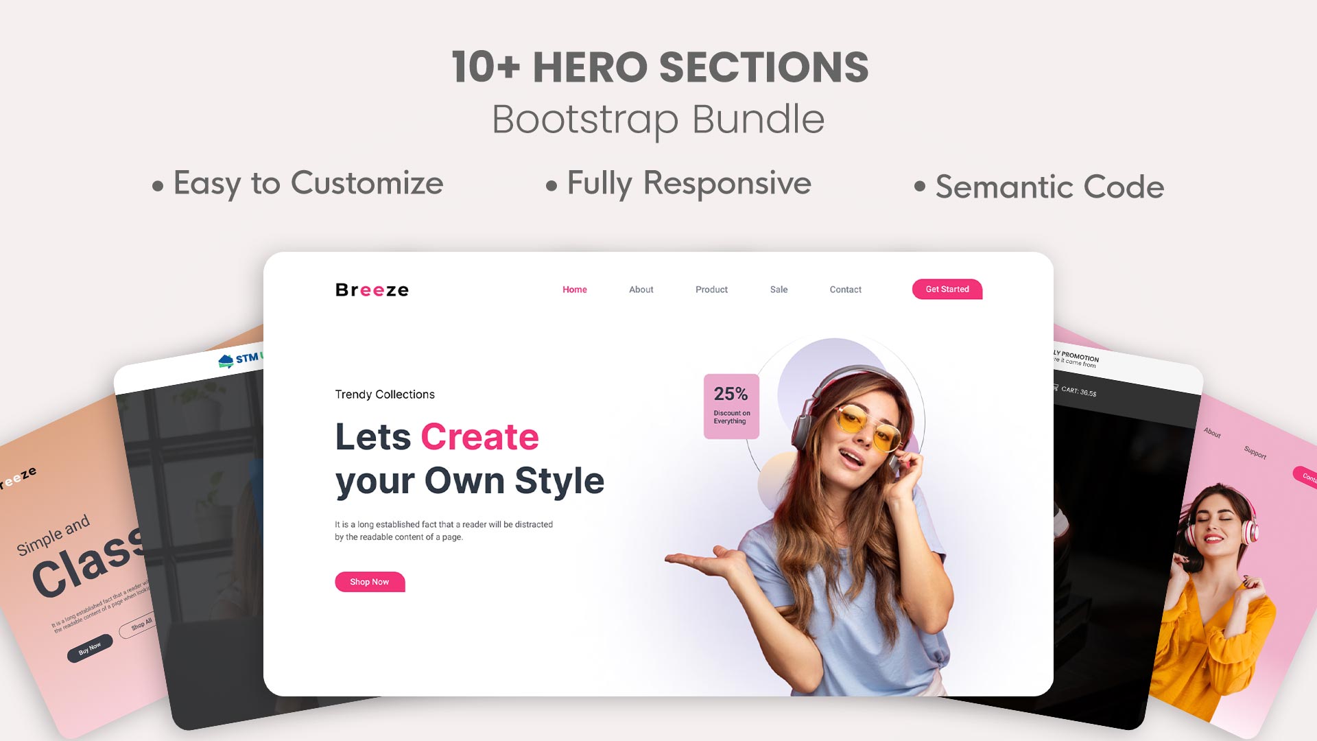
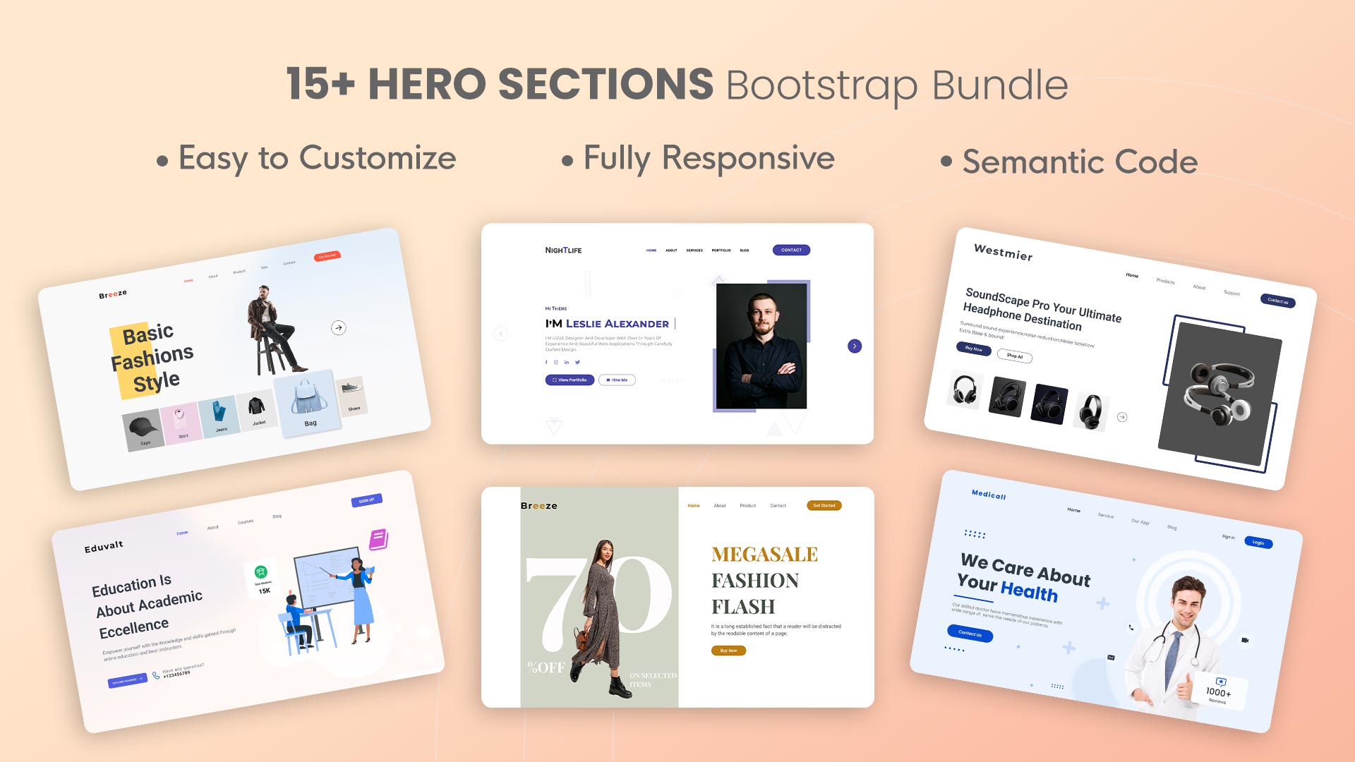
Want hero sections already built to these standards? Our hero section UI kits and free Bootstrap hero templates give you tested, accessible patterns to start from.
Some pre-built best hero section design
Below are some pre-built best hero section designs with download links:

Frequently asked questions
What makes a hero section high-converting?
A benefit-led headline, a single clear CTA, a supportive (not distracting) visual, and a fast load. Clarity and focus convert better than visual complexity.
Should a hero section have a carousel?
No. Auto-rotating carousels consistently underperform a single static message because they split attention and hurt load time. Choose your strongest offer and commit to it.
How tall should a hero section be?
Tall enough to deliver headline, subhead, and CTA above the fold, but not so tall that the next section is hidden. A visible hint of content below encourages scrolling.
What’s the ideal hero load time?
Largest Contentful Paint under 2.5 seconds. Since the hero is usually the LCP element, optimizing its image format and size is the highest-leverage performance fix on most pages.
Skip the trial and error — start from a production-ready hero UI kit and ship a converting hero today.