Tips for Creating User-Friendly Navigation in WordPress
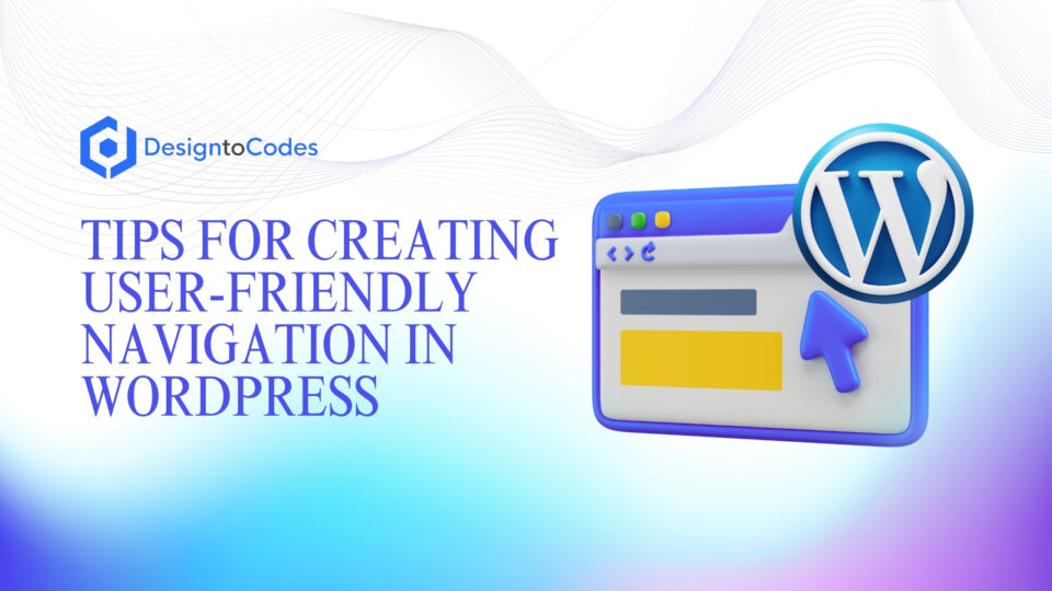
Effective navigation is crucial for the success of any WordPress website. A user-friendly navigation structure enhances website usability, improves the overall user experience, and helps visitors easily find the information they’re looking for. This article will explore various tips and best practices for creating intuitive and seamless navigation in WordPress sites, from planning the site architecture to implementing responsive design and leveraging features like breadcrumbs. By following these guidelines, you can ensure your WordPress website provides a smooth and engaging browsing experience for your visitors.
Key Takeaways
- Effective navigation enhances website usability and user experience.
- Planning a well-structured site architecture is crucial for intuitive navigation.
- Utilize WordPress’s navigation menu features to organize content logically.
- Implement responsive design to optimize navigation for mobile devices.
- Leverage breadcrumb navigation to help users understand site structure.
- Continuously test and refine navigation based on user feedback and analytics.
- Ensure consistent and visually appealing navigation across the entire WordPress site.
Importance of User-Friendly Navigation
Investing in a well-designed navigation system is crucial for the success of any WordPress website. User-friendly navigation enhances the overall website usability, making it easier for visitors to find the information they need and navigate through your content. A clear and intuitive navigation structure can significantly improve the user experience (ux), leading to increased engagement, higher conversion rates, and better retention of your audience.
Enhancing Website Usability
By prioritizing user-centric navigation, you can create a website that is both visually appealing and highly functional, ultimately driving better results for your business or organization. A well-designed navigation system helps users quickly locate the information they’re seeking, reducing the cognitive load and improving the overall information architecture of your site.
Improving User Experience
A user-friendly navigation experience can have a significant impact on the overall user experience (ux) of your WordPress website. When visitors can easily navigate your site and find the content they’re interested in, they are more likely to engage with your brand, convert into leads or customers, and become loyal advocates. By prioritizing intuitive layouts and a streamlined navigation structure, you can create a positive and memorable experience for your users, leading to increased satisfaction and loyalty.
Planning Your WordPress Navigation Structure
Effective navigation begins with a well-planned site structure and information architecture. Start by conducting user research to understand your target audience, their needs, and their browsing behavior. This will help you identify the most important content and features that should be easily accessible through your navigation.
Conducting User Research
User research is a crucial step in planning your WordPress navigation structure. By understanding the needs, goals, and behavior of your target audience, you can create a navigation system that aligns with their expectations and enhances their overall website experience. Gather insights through methods such as user interviews, surveys, and observational studies to uncover patterns and pain points that will inform your navigation design.
Mapping Out Site Architecture
With a clear understanding of your users’ needs, the next step is to map out your site architecture. Organize your content and pages in a logical and intuitive manner, creating a hierarchy that reflects the relationships between different sections of your WordPress website. Consider creating a visual sitemap to visualize the structure and make it easier to identify any potential navigation challenges or opportunities for improvement.
By planning your navigation structure with your users in mind, you can create a seamless and user-friendly experience that aligns with their expectations and needs. This strategic approach to site structure and information architecture will lay the foundation for a WordPress website that is both visually appealing and highly functional.
Utilizing WordPress Navigation Menus
WordPress provides a robust and flexible navigation system that allows you to create and customize your site’s menus. Utilize the built-in WordPress menu management tools to organize your content into logical and easy-to-navigate menus. Arrange your main menu items in a clear and intuitive hierarchy, making it easy for users to quickly find the information they’re looking for. Consider using descriptive and concise menu labels that accurately reflect the content and functionality of each section. Additionally, explore the use of dropdown menus, mega menus, or other advanced navigation features to further enhance the user experience and provide quick access to related content.
By leveraging the powerful WordPress navigation menus, you can create a cohesive and user-friendly site structure that guides visitors through your content with ease. This not only improves the overall usability of your website but also contributes to a more intuitive layout that resonates with your target audience.
Implementing Responsive Design
In today’s mobile-centric world, it’s crucial to ensure your WordPress site’s navigation is optimized for a seamless user experience across all devices. Implement a responsive design approach that adapts your navigation menus and layouts to different screen sizes and resolutions. This includes optimizing menu structures, adjusting font sizes, and ensuring touch-friendly interactions for mobile users.
Optimizing for Mobile Devices
When it comes to mobile optimization, your WordPress site’s navigation must be easy to navigate and interact with on smaller screens. Streamline your menu structures, reduce the number of top-level items, and ensure that navigation elements are spaced appropriately for touch-based interaction. Additionally, consider implementing responsive design techniques, such as adjusting font sizes and layout, to create a visually appealing and user-friendly experience for mobile users.
Ensuring Cross-Browser Compatibility
Alongside responsive design and mobile optimization, it’s essential to ensure your WordPress site’s navigation is compatible across multiple web browsers. Test your navigation menus, layouts, and interactive features to ensure consistent and reliable performance, regardless of the browser or device used by your visitors. Cross-browser compatibility is a critical component in delivering a high-quality website usability experience for your audience.
Tips for Creating User-Friendly Navigation in WordPress Sites
To create a truly user-friendly navigation in your WordPress site, consider the following tips:
- Keep your main menu concise and focused, with no more than 7-8 top-level menu items.
- Use clear and descriptive menu labels that accurately reflect the content and functionality of each section.
- Organize your content in a logical and intuitive hierarchy, making it easy for users to find what they’re looking for.
- Leverage breadcrumb navigation to help users understand their current location within the site and easily navigate back to higher-level pages.
- Implement search functionality to allow users to quickly find specific content or features.
- Ensure your navigation is consistent across all pages, maintaining a familiar and intuitive browsing experience.
- Continuously test and optimize your navigation based on user feedback and analytics data.
By following these tips, you can create a WordPress site with a user-friendly navigation that enhances the overall website usability and user experience (UX), guiding visitors through your content with ease and intuitive layouts.
Breadcrumb Navigation Best Practices
Breadcrumb navigation is a powerful feature that can greatly enhance the user experience on your WordPress site. By displaying the user’s current location within the site hierarchy, breadcrumbs help users understand the structure of your website and quickly navigate back to higher-level pages. This intuitive navigation system can significantly improve the overall website navigation for your visitors.
Enhancing Website Navigation
Breadcrumbs provide clear visual cues that guide users through your website’s content, making it easier for them to explore and find the information they need. By incorporating breadcrumb navigation, you can effectively reduce the cognitive load on your users, allowing them to focus on the content rather than grappling with complex site architecture. This enhanced navigation experience can lead to increased engagement, reduced bounce rates, and higher user satisfaction.
Improving SEO
In addition to improving the user experience, breadcrumb navigation can also have a positive impact on your website’s search engine optimization (SEO). Breadcrumbs provide clear and logical internal linking, which can improve the crawlability and indexation of your site by search engines. This structured navigation hierarchy can help search engines better understand the relationships between your content, ultimately leading to improved visibility and higher rankings in search results.
When implementing breadcrumb navigation on your WordPress site, it’s crucial to follow best practices. Use clear and descriptive labels that accurately reflect the user’s current location, ensure consistent placement and styling of the breadcrumbs, and integrate them seamlessly into your overall navigation structure. By adhering to these guidelines, you can create a breadcrumb navigation system that enhances the user experience and supports your search engine optimization efforts.
Intuitive Site Structure and Layout
Creating an intuitive site structure and layout is essential for delivering a user-friendly navigation experience. Organize your content in a logical and hierarchical manner, ensuring that related pages and information are grouped together. This helps users quickly understand the overall site structure of your WordPress site and easily find the content they’re looking for.
Organizing Content Logically
When it comes to information architecture, it’s crucial to consider how your content is structured and presented to users. Group related pages and information together, creating a clear and intuitive hierarchy that aligns with your users’ mental models and expectations. This not only enhances the user experience (ux) but also enables visitors to navigate your WordPress site more efficiently.
Minimizing Cognitive Load
In addition to organizing your content logically, it’s important to strive for simplicity and clarity in your site’s layout and design. Avoid clutter and unnecessary complexity, which can overwhelm users and increase their cognitive load. Present information in a concise and easy-to-digest manner, guiding visitors through your content with ease. By minimizing cognitive load, you can create a more user-friendly and engaging experience for your WordPress site’s audience.
Incorporating Visual Cues and Signposts
Leverage visual cues and signposts to help users navigate your WordPress site with ease. Incorporate design elements such as icon-based menus, hover effects, and visual hierarchies to guide users through your content. Use contrasting colors, typography, and spacing to differentiate between navigation elements and draw attention to important sections.
Guiding Users Through Your Site
Additionally, consider incorporating visual aids like arrows, breadcrumbs, and visual maps to provide clear signposts and help users understand their current location within the site. By incorporating these visual cues, you can create a more intuitive and user-friendly navigation experience that enhances overall engagement and satisfaction. This approach aligns with the principles of user experience (UX) and website usability, ensuring your WordPress site offers an intuitive layout that seamlessly guides visitors through your content.
FAQ
What are the key considerations for creating user-friendly navigation in a WordPress site?
Some of the key considerations for creating user-friendly navigation in a WordPress site include planning the site architecture, utilizing WordPress navigation menus, implementing responsive design, incorporating visual cues and signposts, and maintaining an intuitive site structure and layout.
Why is user-friendly navigation important for a WordPress website?
User-friendly navigation is crucial for enhancing website usability, improving the overall user experience, and helping visitors easily find the information they’re looking for. A clear and intuitive navigation structure can significantly increase engagement, conversion rates, and audience retention.
How can I plan an effective navigation structure for my WordPress site?
To plan an effective navigation structure, start by conducting user research to understand your target audience and their needs. Then, map out your site architecture, organizing your content and pages in a logical and intuitive manner. Consider creating a visual sitemap to visualize the hierarchy and relationships between different sections of your WordPress website.
What are the best practices for utilizing WordPress navigation menus?
Best practices for utilizing WordPress navigation menus include keeping your main menu concise and focused, using clear and descriptive menu labels, organizing your content in a logical hierarchy, and exploring the use of dropdown menus or other advanced navigation features to enhance the user experience.
How can I ensure my WordPress site’s navigation is responsive and optimized for mobile devices?
To ensure your WordPress site’s navigation is responsive and optimized for mobile devices, implement a responsive design approach that adapts your menu structures, layouts, and interactions to different screen sizes and resolutions. This includes optimizing font sizes, touch-friendly interactions, and ensuring cross-browser compatibility.
What are the benefits of incorporating breadcrumb navigation on my WordPress site?
Breadcrumb navigation can greatly enhance the user experience by helping users understand their current location within the site hierarchy and easily navigate back to higher-level pages. Additionally, breadcrumbs can positively impact your site’s search engine optimization (SEO) by providing clear and logical internal linking.
How can I create an intuitive site structure and layout for my WordPress website?
To create an intuitive site structure and layout, organize your content in a logical and hierarchical manner, ensuring that related pages and information are grouped together. Strive to minimize cognitive load by presenting information in a clear and concise manner, avoiding clutter and unnecessary complexity.
- Categories: Reading
Recent Posts
Recent Products
Share This Post
Subscribe To Our Newsletter
Get More Update and Stay Connected with Us


