
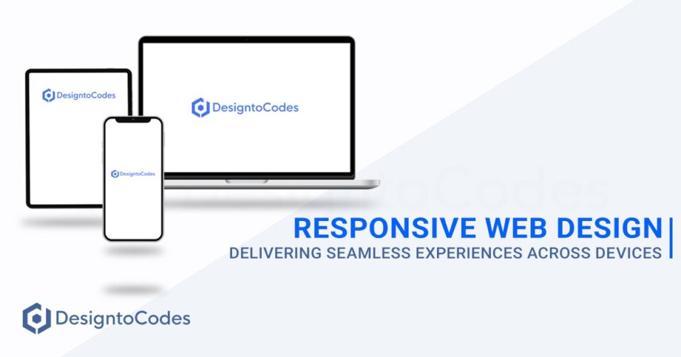
Today, when people are browsing websites on various devices with different screen sizes, the significance of responsive web design cannot be overstated. It’s no longer enough to have a static website that looks great on a desktop but falls short on mobile devices.
Responsive web design has become a pivotal factor in ensuring a seamless and engaging user experience across all platforms. In this article, we will explore the core concepts of responsive web design and explore its importance in delivering exceptional user experiences.

What is Responsive Web Design?
Responsive web design is a method to building websites that adapt and respond to any screen sizes, ensuring that the content and layout look appealing and functional across all devices, including desktops, laptops, tablets, and smartphones. A responsive website adjusts its elements dynamically, depending on the user’s device, creating a smooth and user-friendly experience.
The concept of responsive web design revolves around using flexible grids, fluid images, and media queries to detect the user’s screen size and adjust the layout accordingly. By doing so, the website can deliver the best possible experience, regardless of the device used to access it.
Importance of Mobile-Centric Design
The rise of mobile internet usage has been remarkable in recent years, with more users accessing the web through their smartphones than ever before. As such, Google and other search engines have recognized the significance of mobile-friendly websites and have made mobile responsiveness a critical factor in search rankings.
Search engines like Google care a lot about how people feel when they use a website. Making your site work well on mobile phones is really important for that. If websites don’t work well on mobile phones, they can have lots of people leaving quickly and not doing much, which can make them show up lower in search results. On the other hand, a responsive website ensures a seamless browsing experience, leading to higher user engagement, longer session durations, and ultimately, improved search rankings.
Enhanced User Experience
User experience (UX) is a key aspect of successful online businesses. A responsive web design makes sure that people can easily use your website, read stuff, and connect with your brand, no matter what device they’re using. It eliminates the need for users to pinch, zoom, or scroll excessively, providing a more intuitive and enjoyable experience.
When users have a positive experience on your website, they are more likely to stay longer, explore other pages, and take desired actions, such as making a purchase, signing up for newsletters, or contacting your business. This improved user experience not only boosts conversions and sales but also contributes to higher search rankings, as search engines recognize the value you provide to your audience.

Advantages of Responsive Web Design
- Improved User Experience: Responsive websites offer a consistent and user-friendly experience across all devices. Users can easily navigate and interact with the site, leading to higher engagement and longer visit durations.
- Time and Cost-Effectiveness: Developing a single responsive website is more cost-effective than building multiple versions for different devices. Additionally, maintaining a single codebase reduces development time and effort.
- Enhanced SEO Performance: Search engines favor responsive websites because they provide a better user experience. Responsive design improves website accessibility, leading to higher search engine rankings.
- Increased Mobile Traffic Conversion: Responsive websites are optimized for mobile users, resulting in higher conversion rates for mobile visitors. Easy navigation and clear calls-to-action boost user interactions.
- Simplified Analytics: Monitoring website performance is more straightforward with a single responsive site, as you can track traffic, conversions, and user behavior from one dashboard.
Key Elements of Responsive Web Design
- Flexible Grid Layout: The foundation of responsive design is a flexible grid system that allows elements to scale proportionally based on the screen size.
- Media Queries: CSS media queries enable websites to apply different styles and layouts based on the user’s device characteristics, such as screen size and resolution.
- Fluid Images: Images are crucial elements of a website, and they must adapt to different screen sizes seamlessly.
- Breakpoints: Breakpoints are predefined screen widths where the website’s layout changes to better suit various devices.
- Mobile-First Approach: Designing for mobile devices first ensures that the website provides a seamless experience on smaller screens, and then progressively enhances the design for larger devices.
Techniques for Creating Responsive Websites
- Fluid Layouts: Designing fluid layouts with percentages instead of fixed pixel values allows elements to adjust automatically according to the screen size.
- Viewport Meta Tag: The viewport meta tag sets the viewport’s width and scale, ensuring that the website fits the user’s screen correctly.
- Flexible Typography: Using relative units like “em” or “rem” for fonts allows them to scale with the screen size, improving readability.
- Optimized Navigation: Mobile navigation should be simple, intuitive, and accessible, making it easy for users to find what they need.
Using Media Queries to Improve Your Design
Media queries are CSS rules that apply specific styles based on the user’s device characteristics. Web designers can use media queries to make special layouts and make the user experience better for various screen sizes. For example:
@media screen and (max-width: 768px) {
/* Styles for screens smaller than 768px (e.g., smartphones) */
}@media screen and (min-width: 769px) and (max-width: 1024px) {
/* Styles for screens between 769px and 1024px (e.g., tablets) */
}@media screen and (min-width: 1025px) {
/* Styles for screens larger than 1024px (e.g., desktops) */
}
Best Practices for Responsive Web Design
- Optimize Images and Media: Compress images and videos to reduce loading times and improve overall site performance.
- Prioritize Mobile Load Times: Ensure that the mobile version of your site loads quickly, as slow loading times can lead to higher bounce rates.
- Test on Multiple Devices: Try your responsive website on different devices and screen sizes to make sure it works well all the time.
- Avoid Flash and Pop-ups: Flash elements and pop-ups can be problematic on mobile devices and should be avoided.
- Provide Clear Call-to-Actions: Make it easy for users to take action, such as filling out a form or making a purchase.
Addressing Common Responsive Design Challenges
- Content Overloading: Too much content can overwhelm mobile users, leading to a poor user experience. Prioritize essential content and use collapsible sections for additional information.
- Font Legibility: Ensure that font sizes and styles are legible on all screen sizes.
- Complex Navigation: Simplify navigation by using hamburger menus or slide-out drawers for mobile devices.
Responsive Web Design and SEO
Responsive web design directly influences a website’s search engine rankings and overall SEO performance. Google and other search engines give more importance to websites that work well on mobile devices when showing search results. Additionally, a single responsive website with consistent content and URLs consolidates SEO efforts, leading to higher rankings.

Enhancing Accessibility for All Users
- Keyboard Navigation: Ensure that all interactive elements can be accessed using only a keyboard, improving accessibility for individuals with disabilities.
- Text Alternatives for Images: Provide descriptive alt text for images, enabling screen readers to convey the image content to visually impaired users.
- Contrast and Color: Use high contrast and avoid relying solely on color to convey information.
- Captioned Media: Include captions or transcripts for audio and video content, benefiting users who are deaf or hard of hearing.
Responsive Design on E-commerce
Responsive web design has a significant impact on e-commerce businesses. By providing a seamless shopping experience across devices, responsive websites can boost conversion rates and customer satisfaction. Additionally, Google’s mobile-first indexing means that non-responsive sites may see a drop in search rankings.
Mobile App vs. Responsive Website
Choosing between a mobile app and a responsive website depends on the business’s goals and target audience. Mobile apps are handy with offline access and alerts, yet responsive websites are cheaper and simpler to keep up. Small businesses might go for responsive sites, while big ones could have both to please different users.
Future Trends in Responsive Web Design
- AR and VR Integration: As augmented reality (AR) and virtual reality (VR) become more prominent, responsive web design will need to accommodate these technologies seamlessly.
- Voice Search Optimization: With the rise of voice-activated devices, responsive websites should be optimized for voice search queries.
- Artificial Intelligence: AI-driven personalization and content recommendations will play a vital role in responsive web design, tailoring experiences to individual users.
Conclusion
In conclusion, having a responsive web design is crucial for businesses aiming to excel in today’s mobile-centric digital world. By providing seamless experiences across devices, responsive websites improve user engagement, increase conversions, and boost search engine rankings. The benefits of responsive web design are far-reaching, including enhanced user experience, faster page load speeds, consistent branding, and cost-efficiency in maintenance.
Making your website work well on phones is like a smart investment. It helps your site show up higher in searches, brings in more visitors, and boosts your earnings. If you want to beat your competitors and do well online, you should use a design that looks good on mobiles.
So, what are you waiting for? Take the necessary steps to make your website responsive and position yourself for success in the ever-evolving digital landscape.


