
In the digital landscape, your website serves as a virtual storefront, and its colors play a pivotal role in shaping user experience, brand perception, and engagement. Colors influence emotions, guide navigation, and drive actions like clicking a button or making a purchase. Research indicates that 92.6% of consumers consider visual elements, including color, the most influential factor in purchase decisions, while color can boost brand recognition by up to 80% (University of Loyola, Maryland). Choosing the right colors for your website is both an art and a science, blending color theory, psychology, and practical considerations like accessibility. This comprehensive guide, tailored for DesignToCodes users, provides a step-by-step approach to selecting a color palette that captivates your audience, aligns with your brand, and enhances functionality. Whether you’re designing a portfolio, e-commerce site, or blog, these insights will help you create a visually stunning and effective website.
Understanding Color Theory
Color theory is a framework that explains how colors interact, combine, and affect human perception. It provides guidelines for creating harmonious and visually appealing color schemes, essential for effective web design.
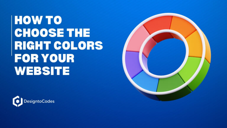
The Color Wheel
The color wheel is a circular arrangement of colors, illustrating their relationships. It includes:
-
Primary Colors: Red, Blue, Yellow (or Magenta, Cyan, Yellow in some models), the foundation of all other colors.
-
Secondary Colors: Orange, Green, Purple, created by mixing primary colors.
-
Tertiary Colors: Combinations like Yellow-Green or Blue-Purple, formed by mixing primary and secondary colors.
The color wheel, rooted in Sir Isaac Newton’s 17th-century experiments, is a powerful tool for visualizing color relationships and building cohesive palettes.
Color Relationships
Different color schemes create varied visual effects:
-
Monochromatic: Uses variations of a single color (tints and shades) for a cohesive, minimalist look, ideal for clean designs.
-
Complementary: Pairs colors opposite each other on the wheel (e.g., blue and orange) for high contrast and vibrancy, perfect for highlighting elements.
-
Analogous: Combines adjacent colors (e.g., blue, blue-green, green) for harmony and a soothing effect, suitable for calming interfaces.
-
Triadic: Uses three evenly spaced colors (e.g., red, blue, yellow) for a balanced, vibrant palette, great for dynamic websites.
Color Warmth
Colors are categorized by their emotional tone:
-
Warm Colors (Red, Orange, Yellow): Evoke energy, passion, and warmth, often used to grab attention or create urgency.
-
Cool Colors (Blue, Green, Purple): Convey calmness, trust, and professionalism, ideal for corporate or health-related sites.
-
Neutral Colors (White, Black, Gray): Provide balance and versatility, often used for backgrounds or text.
Color Systems
In web design, colors are defined using:
-
RGB: Represents colors by Red, Green, Blue values (0-255), used for digital displays.
-
HEX Codes: Six-digit codes (e.g., #FFFFFF for white, #000000 for black) for precise color specification.
-
CMYK: Used for print, not web, involving Cyan, Magenta, Yellow, and Black.
Understanding these basics ensures your color choices are technically sound and visually harmonious.
Color Psychology
Color psychology examines how colors influence emotions and behaviors, making it a critical tool for web designers aiming to evoke specific responses.
Emotional Impact of Colors
Each color carries unique associations, though perceptions can vary by culture, age, or personal experience:
-
Red: Conveys energy, passion, and urgency. Often used for call-to-action (CTA) buttons to prompt action, as seen in brands like Coca-Cola.
-
Blue: Symbolizes trust, reliability, and calmness, making it a favorite for tech and financial companies like Facebook or PayPal.
-
Green: Represents nature, growth, and health, ideal for wellness or environmental brands like Whole Foods.
-
Yellow: Evokes happiness, optimism, and caution, used by brands like McDonald’s to attract attention.
-
Purple: Suggests luxury, creativity, and mystery, popular in beauty or artistic industries, as seen in Cadbury’s branding.
-
Orange: Combines enthusiasm and warmth, effective for engaging users, as used by brands like Nike.
-
Black: Denotes elegance, power, and sophistication, common in luxury brands like Chanel.
-
White: Represents purity, simplicity, and cleanliness, often used in minimalist designs by brands like Apple.
Cultural Considerations
Color meanings vary across cultures, which is crucial for websites targeting diverse audiences:
-
In Western cultures, white symbolizes purity, but in many Asian cultures, it’s associated with death and mourning.
-
Red signifies luck in China but danger or urgency in the U.S.
-
Blue is seen as masculine in Western cultures but feminine in China.
To avoid missteps, research your target audience’s cultural context and conduct user testing to confirm color choices resonate appropriately.
Table: Color Meanings and Industry Applications
|
Color |
Emotions/Associations |
Common Industries |
|---|---|---|
|
Red |
Passion, energy, urgency |
Food, retail, entertainment |
|
Blue |
Trust, reliability, calm |
Finance, technology, healthcare |
|
Green |
Nature, growth, health |
Environment, wellness, finance |
|
Yellow |
Happiness, optimism, caution |
Food, travel, education |
|
Purple |
Luxury, creativity, mystery |
Beauty, arts, spirituality |
|
Orange |
Enthusiasm, creativity, warmth |
Sports, food, technology |
|
Black |
Elegance, power, sophistication |
Fashion, luxury, technology |
|
White |
Purity, simplicity, cleanliness |
Healthcare, technology, fashion |
Step-by-Step Guide to Choosing a Color Palette
Selecting a color palette involves a strategic process that balances aesthetics, brand identity, and user experience. Follow these steps to create an effective palette:
Step 1: Understand Your Brand and Audience
-
Define Brand Values: Identify the emotions and qualities your brand aims to convey. For example, a financial institution might prioritize trust (blue), while a creative agency might emphasize innovation (purple).
-
Know Your Audience: Consider demographics like age, gender, and cultural background. Younger audiences may respond to vibrant colors, while older users might prefer subdued tones.
-
Analyze Competitors: Study competitors’ color schemes to differentiate your brand while staying relevant within your industry.
Step 2: Choose a Primary Color
-
Select a color that embodies your brand’s core identity. For instance, a health-focused brand might choose green to evoke wellness.
-
Use color psychology to ensure the color aligns with the desired emotional response. For example, red for a food brand to stimulate appetite.
Step 3: Select Secondary and Accent Colors
-
Use color theory to choose complementary colors. For example, pair a primary blue with analogous green and purple for harmony, or complementary orange for contrast.
-
Apply the 60/30/10 rule: 60% primary color (main background, large sections), 30% secondary color (supporting elements like headers), and 10% accent color (buttons, links).
-
Tools like Adobe Color (Adobe Color) can generate harmonious palettes based on your primary color.
Step 4: Ensure Accessibility
-
Verify that color combinations meet Web Content Accessibility Guidelines (WCAG) standards, requiring a contrast ratio of at least 4.5:1 for normal text and 3:1 for large text (18pt or 14pt bold).
-
Use tools like WebAIM Contrast Checker (WebAIM) or Color Safe (Color Safe) to test contrast.
-
Avoid relying solely on color to convey information (e.g., use labels or patterns for charts to accommodate colorblind users).
Step 5: Test and Refine Your Palette
-
Create mockups or prototypes using your chosen colors to visualize their impact.
-
Gather feedback from stakeholders or conduct A/B testing to assess user response.
-
Adjust colors if they don’t align with your brand or fail to engage users effectively.
Step 6: Implement Consistently
-
Define color variables in CSS (e.g., –primary-color: #3b5998) for easy maintenance.
-
Ensure all design elements—backgrounds, text, buttons, navigation—adhere to the palette.
-
Use DesignToCodes templates to apply your palette seamlessly across responsive layouts.
Practical Tips for Effective Color Use
-
Limit Your Palette: Use 3-5 colors to avoid overwhelming users and maintain a cohesive look.
-
Leverage White Space: Neutral backgrounds (white, gray) make colors pop and improve readability.
-
Optimize for CTAs: Choose high-contrast colors for call-to-action buttons to draw attention. Research suggests contrast, not a specific color, drives clicks (CXL).
-
Consider Cultural Nuances: Research your audience’s cultural perceptions to avoid unintended meanings.
-
Stay Inspired by Trends: In 2025, warm colors like Mocha Mousse (Pantone’s Color of the Year) and ruby reds are trending, but prioritize brand alignment (Pantone 2025).
-
Use Design Tools: Tools like Adobe Color or Coolors help generate and test palettes efficiently.
Common Mistakes to Avoid
-
Overusing Colors: Too many colors can create visual clutter and confuse users.
-
Ignoring Accessibility: Low contrast can exclude users with visual impairments, impacting 8% of men and 0.5% of women with color vision deficiencies.
-
Misaligning with Brand: Colors that don’t reflect your brand’s identity can weaken recognition.
-
Neglecting Testing: Failing to test colors with real users can lead to ineffective choices.
-
Over-Reliance on Trends: Trendy colors like digital lavender may not suit every brand.
Applying Colors to Website Elements
-
Backgrounds: Use neutral or primary colors for backgrounds to create a consistent base. For example, a white background with blue accents conveys professionalism.
-
Text: Ensure high contrast (e.g., dark text on light backgrounds) for readability.
-
Buttons and CTAs: Use vibrant accent colors like red or orange to make buttons stand out, but test for effectiveness.
-
Navigation: Use secondary colors for menus to differentiate them from content while maintaining harmony.
-
Visual Hierarchy: Apply colors strategically to guide users’ attention, such as using yellow for highlights.
Real-World Examples
-
Tech Industry: Companies like Facebook use blue (#3b5998) to convey trust and reliability, paired with white for a clean look.
-
Food and Beverage: Coca-Cola’s red and white palette creates energy and brand consistency, with red stimulating appetite.
-
E-commerce: Amazon uses orange for its “Add to Cart” buttons, leveraging its warmth to encourage purchases.
-
Wellness: Brands like Lululemon use green and purple to evoke health and creativity, appealing to their active audience.
Conclusion
Choosing the right colors for your website is a strategic process that blends color theory, psychology, and practical considerations. By understanding your brand, leveraging color relationships, ensuring accessibility, and testing your palette, you can create a website that captivates users and reinforces your identity. DesignToCodes offers templates that make it easy to implement your chosen colors, ensuring a professional and engaging result. Experiment with colors, test with your audience, and let your website shine with a palette that resonates.