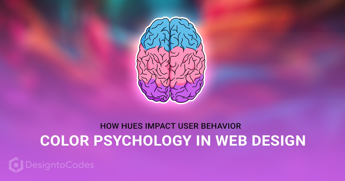
Have you ever wondered why certain websites make you feel calm and relaxed while others ignite excitement and energy? The secret lies in the art of color psychology in web design. The colors you choose for your website can profoundly impact user behavior and emotions, influencing their decisions and interactions. This article will explore the fascinating world of color psychology and uncover how various hues can shape the way users perceive and engage with your website.
The Power of First Impressions
The first impression matters, and color plays a pivotal role in forming it. When users land on a website, their initial assessment is often driven by the colors they encounter. Warm tones like red and orange can convey energy and excitement, while cool blues and greens evoke a sense of calmness and trust. A harmonious color palette that aligns with the website’s purpose can instantly captivate visitors.
Colors hold the ability to evoke emotions and trigger memories. Websites seeking to foster specific emotional connections can strategically employ colors to achieve this. For instance, a health and wellness site might use shades of green to invoke feelings of vitality and harmony, creating a bond with users who associate green with well-being.
The Basics of Color Psychology
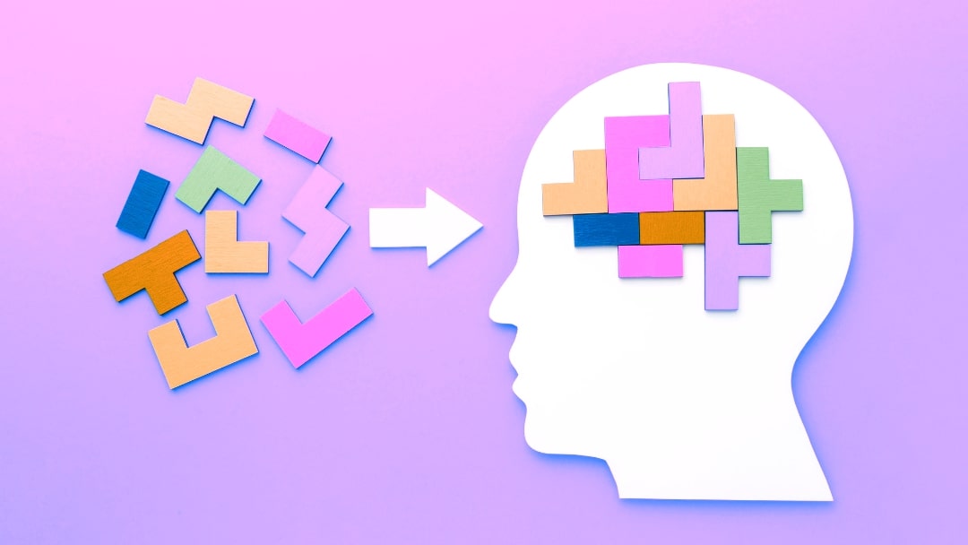
Color psychology is the study of how colors influence human behavior, emotions, and perceptions. It’s a powerful tool used in various fields, including marketing, branding, and web design. Colors have the ability to evoke specific feelings and associations, making them an essential aspect of creating a visually appealing and user-friendly website.
The Emotional Impact of Colors
Ever noticed how warm colors like red and orange seem to grab your attention instantly, while cool colors like blue and green evoke a sense of calm? Each color has its own emotional resonance:
- Red: It exudes energy, urgency, and excitement. Perfect for call-to-action buttons and creating a sense of urgency.
- Blue: Known for instilling trust, stability, and tranquility. Often used by financial institutions to build credibility.
- Yellow: Radiates optimism, happiness, and playfulness. Great for highlighting key information.
- Green: Symbolizes nature, growth, and relaxation. Ideal for websites related to health and well-being.
- Orange: Combines the energy of red with the warmth of yellow. It stimulates enthusiasm and creativity.
- Purple: Represents luxury, creativity, and mystery. Often used in beauty and artistic websites.
- Black and White: Classic and versatile. Black denotes sophistication, while white signifies simplicity and purity.
Applying Color Psychology in Web Design
To harness the power of color psychology in web design, consider these key points:
Call-to-Action Elements
Using contrasting colors for your call-to-action buttons can make them stand out. For instance, if your website predominantly features cool tones, a strategically placed warm-colored button can draw users’ attention and increase conversion rates.
Background
The background color of your website can greatly impact user experience. Light backgrounds with dark text ensure readability, while dark backgrounds can create a dramatic and immersive atmosphere. Choose colors that align with your content and the emotions you want to evoke.
Cohesive Color Palette
Consistency is key. Select a primary color and a few complementary shades to build a cohesive color palette. This palette should reflect your brand’s personality and the emotions you want to associate with it.
Cultural and Contextual Considerations
Colors hold different meanings across cultures. For example, white signifies purity in Western cultures but represents mourning in some Eastern cultures. Consider your target audience’s cultural background when selecting colors to avoid unintended messages.
Color Contrasts and Readability
A critical aspect of web design is ensuring that content remains readable and accessible. The interplay between text and background colors can significantly impact a user’s experience.
High Contrast for Clarity: Using high-contrast combinations—such as black text on a white background—enhances readability and reduces eye strain. This is especially important for lengthy articles, ensuring users can effortlessly consume the content.
Balancing Contrast for Visual Appeal: While high contrast is essential, strategic use of contrasting colors can also create a visually appealing and engaging layout. Carefully selecting hues that complement each other enhances the overall aesthetic while maintaining readability.
Creating Emotional Resonance
Colors have the power to evoke specific emotions and influence user decisions. Understanding this connection allows designers to craft emotionally resonant experiences.
Eliciting Trust and Security: To establish trust and security, financial institutions often utilize shades of blue to convey stability and reliability. This choice reassures users when navigating through sensitive information.
Urgency and Action with Reds: E-commerce websites frequently deploy reds and yellows to induce urgency and prompt users to take immediate action, such as making a purchase or subscribing to a newsletter.
Branding and Consistency
Colors play a pivotal role in branding, contributing to the recognition and memorability of a website. Consistency in color usage across all touchpoints reinforces brand identity.
Color as a Brand Identifier: Distinctive color schemes contribute to brand recognition. Think of the vibrant red associated with Coca-Cola or the calming blue of Facebook. Consistency fosters brand loyalty and memorability.
Color Hierarchy and Communication: Designers can employ color hierarchy to guide users’ attention. Important elements, like headlines or buttons, can be highlighted in contrasting or bold colors, directing users’ focus effectively.
Adapting to Cultural Differences
It’s important to acknowledge that the impact of colors can vary across cultures. What may evoke positive emotions in one culture could have a different connotation in another. Therefore, global brands must take cultural nuances into account when selecting color schemes.
Global expansion demands an understanding of how colors are perceived in different regions. While white symbolizes purity in Western cultures, it signifies mourning in some Asian cultures. Sensitivity to these differences can prevent unintentional miscommunications.
Testing and Iteration
In the ever-evolving landscape of web design, the efficacy of color choices should not be left to assumptions. A/B testing can help determine which color schemes resonate most with users, leading to data-driven decisions and continuous improvement.
Through A/B testing, designers can compare the performance of different color variations to identify the most effective one. This iterative approach ensures that design choices are grounded in tangible results rather than guesswork.
FAQs
Can color choices really influence how users interact with a website?
Absolutely! Colors evoke emotions and can impact user decisions, from clicking buttons to staying longer on a page.
How do I know which colors are suitable for my website’s purpose?
Start by identifying your brand’s values and the emotions you want to evoke. Research your target audience’s preferences and cultural context to inform your color choices.
Can I use multiple colors or should I stick to one?
Using multiple colors can add depth and visual interest to your website. However, ensure they complement each other and follow design principles to maintain cohesiveness.
How often should I update my website’s color scheme?
While there’s no set timeframe, consider periodic updates to keep your website fresh and aligned with evolving design trends and user preferences.
Can color psychology be applied to mobile apps as well?
Absolutely! Color psychology principles apply to all digital interfaces. Tailor your color choices to fit the mobile environment and user behavior.
What if my brand colors clash with color psychology recommendations?
Striking a balance between brand identity and color psychology is crucial. You can incorporate shades of your brand colors while also integrating psychologically effective hues.
How can I test the effectiveness of my chosen color scheme?
A/B testing is an excellent method to evaluate the impact of different color combinations. Compare user engagement and conversion rates to determine the most effective scheme.
Are there tools to help me choose the right colors?
Yes, there are various online color palette generators and tools that provide insights into color harmonies and their psychological implications.
Conclusion: A Kaleidoscope of User Engagement
In the dynamic world of web design, color psychology plays a pivotal role in shaping user behavior and emotions. By understanding the emotional impact of each color and applying this knowledge strategically, you can create a visually appealing and emotionally resonant website that captivates your audience.
Remember, every color choice you make contributes to the overall user experience and the success of your online presence.
Free Download Web UI Kits