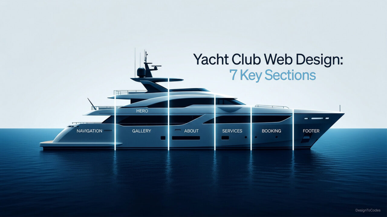
Yacht Club Membership Websites: 7 Sections Every Club Site Needs
Yacht clubs occupy a peculiar corner of the web. They are private institutions with public storefronts, dignified brands with active calendars, century-old crests next to modern booking flows. A modern yacht club website design has to honor that duality: refined enough to read as a club, useful enough to serve members on a Tuesday morning when the tide chart has changed, and the regatta committee needs a faster RSVP. After studying dozens of yacht club sites across North America, the Mediterranean, and Northern Europe, a clear pattern emerges. The clubs that members actually use, and that prospective members actually trust, organize their site around the same seven sections. This guide breaks down each one, with design tips, common mistakes, and reference patterns from the D2C catalog and adjacent industries.

Why Yacht Club Sites Get Redesigned So Rarely — and Fail So Quietly
Yacht club sites are often redesigned once a decade, by committee, in a season that already belongs to regattas and member events. The result is a site that nobody loves, nobody hates, and nobody updates. Members stop checking the site for the calendar, prospective members do not see a clear path to apply, and the commodore’s letter is dated 2019. The fix is not a flashier theme. The fix is an information architecture aligned to how members actually use the site week to week. That architecture has, almost without exception, the same seven sections.
Concept: a yacht club website is read by three audiences — current members, prospective members, and the public. The site has to serve all three without bleeding one audience’s needs into another.
The seven sections that follow are organized in roughly the order a first-time visitor scrolls through the homepage, with member-only depth nested where it belongs.
Section 1: Hero and Welcome — Member-First Messaging
The hero section sets the tone for everyone who lands on the homepage. Done well, it tells a member they are home and tells a prospective member what kind of club this is. Done poorly, it tells everyone the same generic “Welcome to our yacht club” line that could belong to any club from Nantucket to Sardinia.
- Lead with member-first language. “Welcome back” or “Today on the water” plays better than “Welcome to ABC Yacht Club” for the audience that uses the site most.
- Show the crest with intention. Place the club crest where it gets the visual weight it deserves, but do not make the entire hero a logo. Pair it with photography of the actual fleet on the actual water.
- Surface today’s status. Tide window, race signal, weather call — small dynamic data is enormously valuable to members and signals an active club to prospective ones.
- Place a single primary CTA. For most clubs, this is “Member Login,” not “Apply Now.” The prospective-member CTA goes second.
Common mistakes. Stock photography of unidentifiable yachts. A hero video so heavy that the homepage takes six seconds to load on a phone. A “join us” CTA that competes with the member login and confuses both audiences.
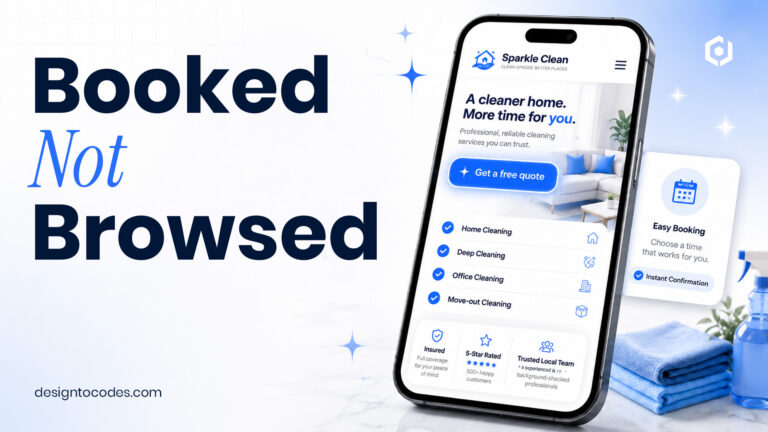
Reference patterns. The hero patterns in the YatchyClub Next.js template and the YatchyClub Framer template are designed for exactly this dual audience: a member-first welcome with a quiet, polite secondary CTA for prospective members.
Section 2: Member Portal — Login, Account, Document Library
The member portal is the section that decides whether members actually use the site. A clunky portal sends members back to email and group chats; a clean portal becomes the club’s nerve center. Three jobs sit at the heart of every working portal.
- Account and profile — name, contact, membership status, dues balance, and household members. Members should be able to update their own contact info without emailing the secretary.
- Document library — bylaws, member handbook, race instructions, safety briefings, dock rules, mooring assignments, and every form a member ever needs.
- Member directory — opt-in, with privacy controls. Older members tend to be cautious here; younger members want it. A privacy-first toggle resolves the tension.
Design tips. Treat the portal as a real product, not a “members area” tucked under the homepage. Use the same typography and palette as the public site. Make document downloads obvious (PDF icon, file size, last-updated date). Add a search field — members should not have to remember whether the launch waiver lives under “Forms” or “Boating.”
Common mistakes. A login form that returns to an outdated dashboard. Document libraries with twenty PDFs and no organization. A directory that exposes phone numbers without an opt-in. Members notice. Quietly.
Section 3: Fleet and Calendar — The Boat Schedule
The fleet and calendar section is where active boating members live. For clubs with shared boats — keelboats, dinghies, the launch — this section becomes the most visited page on the entire site after the homepage. Design quality here pays dividends every week of the season.
- Per-boat pages. Each boat in the club fleet gets its own page with a photo, specs, current status, maintenance log, and reservation link.
- Shared booking calendar. Members can see the boat schedule, request a slot, and confirm without phoning the dockmaster.
- Tide and weather integration. Pulling NOAA or local marine data into the boat page makes the schedule actionable, not decorative.
- Maintenance log. Quietly important. Members trust a club that publishes when each boat was last serviced.
Reference patterns. The fleet listing patterns from the Sailvu Next.js template translate directly to club use. The calendar logic in the Tripvanta Next.js template is also worth studying for any club building shared-asset booking; Tripvanta solves a similar inventory-meets-calendar problem in a cleaner way than most club bespoke builds.
Concept: members do not want a beautiful calendar. They want to know whether the J/24 is free this Saturday at 2 p.m. The design’s only job is to answer that question in under three seconds.
Section 4: Events and Regattas — Calendar, RSVPs, Galleries
The events and regattas section is the heartbeat of the club’s social life and the most visible signal of vitality to prospective members. A long, well-photographed events page is one of the highest-converting “apply” magnets on a club site.
- Annual calendar at a glance. A full-year view with regatta series, social events, junior programs, and visiting fleet weekends. Members and yacht clubs visiting from elsewhere both reference it.
- Per-event pages. Notice of race or social event details, sailing instructions, results archive, and a clean RSVP form.
- Photo galleries. Year over year. Galleries do more for membership applications than any “Why Join Us” page.
- Results archive. Searchable by year and class. Sailors care deeply about historical results.
Design tips. Pair each event page with a hero photo, a short factual block, and a long, scrollable gallery beneath. Avoid the temptation to embed thirty Facebook galleries; host the photos natively for performance and longevity. Use a calendar widget that syncs to Google Calendar and Apple Calendar — older members appreciate it.
Common mistakes. A “Past Events” archive that ends in 2018. Events are listed only as a Word document download. Photo galleries that load fifty unoptimized JPEGs and crash mobile browsers.
Section 5: Member Benefits — Privileges, Reciprocal Clubs, Dining, Mooring
The member benefits section is where the value of membership becomes legible. For prospective members, this section frequently decides the application. For current members, it is the page they share with friends considering joining.
- Reciprocal clubs. A searchable, ideally mapped list of partner clubs around the world where members enjoy reciprocal privileges. This is a major selling point for traveling members.
- Dining and clubhouse. Menus, opening hours, dress code, private event capacity, and a reservation flow. Treat the clubhouse like a small hospitality brand inside the club brand.
- Mooring and dock benefits. Slip availability, guest docking rules, hauling and launch services, and seasonal pricing.
- Junior programs. Often the most undersold benefit. A dedicated junior page with sailing programs, instructor bios, and a parent-friendly summer schedule earns family memberships.
- Partner privileges. Local marine vendors, boatyards, sailmakers, riggers, and provisioning partners.
Reference patterns. Hospitality-style booking patterns from the Seahotel Next.js template translate directly to clubhouse dining and event reservations. Many clubs that need this layer pull from Seahotel’s component library directly.
| Section | Primary audience | Key components | Member-only? |
|---|---|---|---|
| Hero / Welcome | Members + prospective | Crest, hero imagery, today’s status, dual CTA | Public |
| Member Portal | Members | Account, document library, directory | Members only |
| Fleet & Calendar | Members | Per-boat pages, booking calendar, tide data | Hybrid (public boats, member booking) |
| Events & Regattas | Members + visiting fleet | Calendar, per-event pages, results, galleries | Public |
| Member Benefits | Members + prospective | Reciprocals, dining, mooring, partner privileges | Hybrid |
| Membership Application | Prospective members | Categories, fees, sponsor requirements, form | Public |
| News / Journal | Members + public | Commodore’s letter, history, and recent activity | Public |
Build the club site that members actually use
The YatchyClub series ships every section above with refined typography, member portal patterns, and a calendar that respects how clubs actually operate. One-time purchase, lifetime access, no 30-plugin stack.
Section 6: Membership Application — Categories, Fees, Sponsors
The membership application is, with the events page, the single highest-stakes section on a yacht club site. A confused application form costs the club a year of revenue and a member relationship. A clear application form earns trust and quietly increases the application volume by an order of magnitude.
- Membership categories. Full, intermediate, junior, family, country, honorary, racing, social — each laid out with eligibility, fees, dues, and benefits. Tables work better than paragraphs here.
- Fees and dues. Initiation fee, annual dues, capital assessments if applicable, and any seasonal fees. Transparency wins. Hidden numbers create suspicion in a category where suspicion is fatal.
- Sponsor requirements. Most clubs require two-member sponsors. Explain the convention plainly and provide a simple sponsor-confirmation flow.
- Application form. Multi-step, friendly, mobile-aware. A forty-field single-page PDF is the most common conversion killer in the category.
- Process timeline. Application → membership committee review → interview → approval → onboarding. Telling prospective members the timeline reduces anxiety and inbound emails.
Common mistakes. An application that downloads a Word doc and asks the candidate to email it. No mention of fees on the page (the visitor leaves to research and rarely returns). Sponsor requirements are buried in the bylaws PDF. A form that does not work on mobile.
Reference patterns. The form patterns in the YatchyClub Elementor template are designed for a multi-step membership application; the YatchyClub WordPress theme ships the same patterns for clubs already on WordPress.
Section 7: News and Journal — Commodore’s Letter, History, Activity
The news and journal section is the slowest-burning, most undervalued section on a yacht club website. Members rarely visit it weekly, but when a major moment happens — a regatta win, a passing of a long-time member, a clubhouse renovation — the journal becomes the canonical record. Done consistently, it is also the SEO engine that brings prospective members to the site organically.
- Commodore’s letter. Quarterly, signed, with a photo. The single most-read piece on most club sites.
- Race recaps and event reports. Within forty-eight hours of the event, with photos and results.
- Club history. A long-form page covering founding, notable members, fleet history, and clubhouse milestones. Often, the second-most-linked page from outside.
- Member spotlights. Short profiles of active members with their boats and stories. These pieces build community and are surprisingly effective at converting prospective members.
Design tips. Use editorial typography for the journal section — slightly larger body type, generous line height, plenty of vertical space. Treat each post as a piece of writing worth reading, not a content marketing asset to be measured by bounce rate. Members can tell the difference.
Common mistakes. A journal that has not been updated in nine months. Race recaps that read like minutes from a meeting. A “history” page that is one paragraph long.
Putting the Seven Sections Together
The seven sections are not a checklist to fill in once. They are a lens for evaluating an existing site and a blueprint for building a new one. Yacht clubs that audit their site against this list often discover that the technical work is smaller than expected — the architecture is right, the content is stale, or the navigation is hiding the member portal. Clubs starting from scratch should build the seven sections in roughly the order they were presented, then layer differentiation on top.
For clubs ready to invest in a new site, the YatchyClub series in the D2C catalog ships every section discussed in this guide, across four frameworks. The series hub at YatchyClub: the premium yacht club website series compares all four variants. Clubs that lean toward boutique charter rather than full club functionality may want to start with the Sailvu and YachtX series hub instead, and clubs evaluating the full D2C boat and yacht catalog can browse the May 2026 collection for context.
Three Quiet Lessons From Watching Yacht Club Sites Evolve
Three patterns repeat across the clubs that get this right.
- Members are the primary audience. Sites built for prospective members feel like marketing brochures and quietly disappoint the people who actually pay dues. Sites built for current members read as alive and, paradoxically, attract more prospective members.
- The portal is the product. Public pages get redesigned every five years; the portal gets used every week. Treat it accordingly.
- The journal is the long game. A club that publishes monthly for ten years has a content moat that no amount of one-time-redesign budget can buy.
Yacht clubs that internalize these three lessons and ship the seven sections above tend to wake up two or three seasons later with a site members trust, and prospective members admire.
Where to Go From Here
The most useful next step depends on where the club currently stands. A club in the middle of a planned redesign should print this guide, walk the membership committee through the seven sections, and audit the existing site against each one. A club just exploring options should browse the boat and yacht template collection, take live demos of the YatchyClub series across all four frameworks, and bring a shortlist to the next committee meeting. It’s a club that has tried and abandoned previous redesigns, should pair a premium template with a small implementation partner — most YatchyClub buyers have a working site live in three to six weeks, including content migration.
For clubs interested in the architectural decisions behind a modern club site, two adjacent reads are worth the time: the Tripvanta Next.js template for booking and itinerary patterns, and the Seahotel Next.js template for clubhouse dining and event reservation flows. Both ship clean code and component libraries that translate naturally to club use cases.
Frequently Asked Questions
Q1. What is the most important section on a yacht club website?
For current members, the member portal includes login, document library, and directory. For prospective members, the membership application section. Most clubs underinvest in the portal and overinvest in the public-facing homepage. A well-built portal is the section that decides whether members actually use the site weekly.
Q2. How often should a yacht club redesign its website?
Full redesigns every five to seven years are typical and sensible. Major content refreshes — Commodore’s letter, events archive, fleet pages — should happen continuously. The clubs that struggle are the ones that treat the site as a once-a-decade project rather than a living asset.
Q3. Should a yacht club site have a separate member portal?
Yes. A working member portal with login, document library, and directory is non-negotiable for a modern yacht club website design. Public marketing pages and member tools serve different audiences and should have different navigation patterns, even if they share the same brand identity and visual system.
Q4. How should a yacht club handle reciprocal clubs on its site?
List reciprocal partners on a dedicated page with a searchable directory and, ideally, a map. Include the partner club name, location, contact, and any specific privileges. Members traveling internationally check this page before they travel, and a current, well-organized list is a major retention asset.
Q5. What is the right way to publish a regatta calendar?
A full-year view, integrated with Google Calendar and Apple Calendar subscriptions, paired with per-event pages that contain the notice of race, sailing instructions, results, and post-race photo galleries. Static PDFs alone are no longer acceptable in 2026; a real calendar widget is the standard.
Q6. Should the yacht club website show membership fees publicly?
Yes, in almost all cases. Hidden fees create suspicion in a category that depends on trust. A clear fee structure — initiation, annual dues, and any capital assessments — increases application volume and pre-qualifies candidates. Clubs that prefer not to publish exact figures can publish a “from $X” anchor and offer a private conversation for the full breakdown.
Q7. How long should the membership application form be?
Long enough to capture meaningful information for the committee, short enough to be completed in one sitting on a phone or laptop. A multi-step form with eight to twelve total questions per step, broken into three or four steps, is the format most candidates complete without abandoning. Single-page forms with thirty-plus questions are abandoned at high rates.
Q8. What templates work for a yacht club website?
The YatchyClub series in the D2C catalog ships across Next.js, Framer, Elementor, and WordPress with the seven sections discussed in this guide pre-built. Clubs leaning toward charter-style operations can start from the Sailvu series. The right pick depends on the club’s existing tech stack and whether the website committee or a marketing manager will own day-to-day updates.
Q9. How important is mobile design for a yacht club site?
Critical. Members check the site from boats, docks, and parking lots. Prospective members research from their phones. A site that loads slowly on a phone or hides the member login behind a small icon will frustrate the audience that uses the site the most. Modern templates ship mobile-first patterns by default.
Q10. Can a yacht club run its site without a developer on retainer?
Yes, with the right framework choice. A WordPress or Framer build can be maintained by a marketing manager or volunteer member with reasonable training. Next.js builds tend to need a fractional developer for occasional updates. The D2C catalog ships the same yacht club website design across all four frameworks for exactly this reason — clubs pick by team, not by trend.
Build the club site members deserve. The YatchyClub Next.js template ships the seven sections above with refined typography and a clean component library. For Framer-led teams, the YatchyClub Framer template is the fastest path to a polished launch. For WordPress-first clubs, the YatchyClub WordPress theme integrates with existing tooling. Whichever framework fits the club’s team, the seven sections — and the people they serve — stay the same.